Shiny App: US Obesity Analysis
Interactive platform comparing obesity rates across US states by ethnicity, year, and percentage range
View Live App ↗Overview
This Shiny app is an in-depth interactive platform analyzing obesity rates across the United States. Users can filter the data by ethnicity, year range, and obesity percentage intervals, and all visualizations update reactively to the selections.
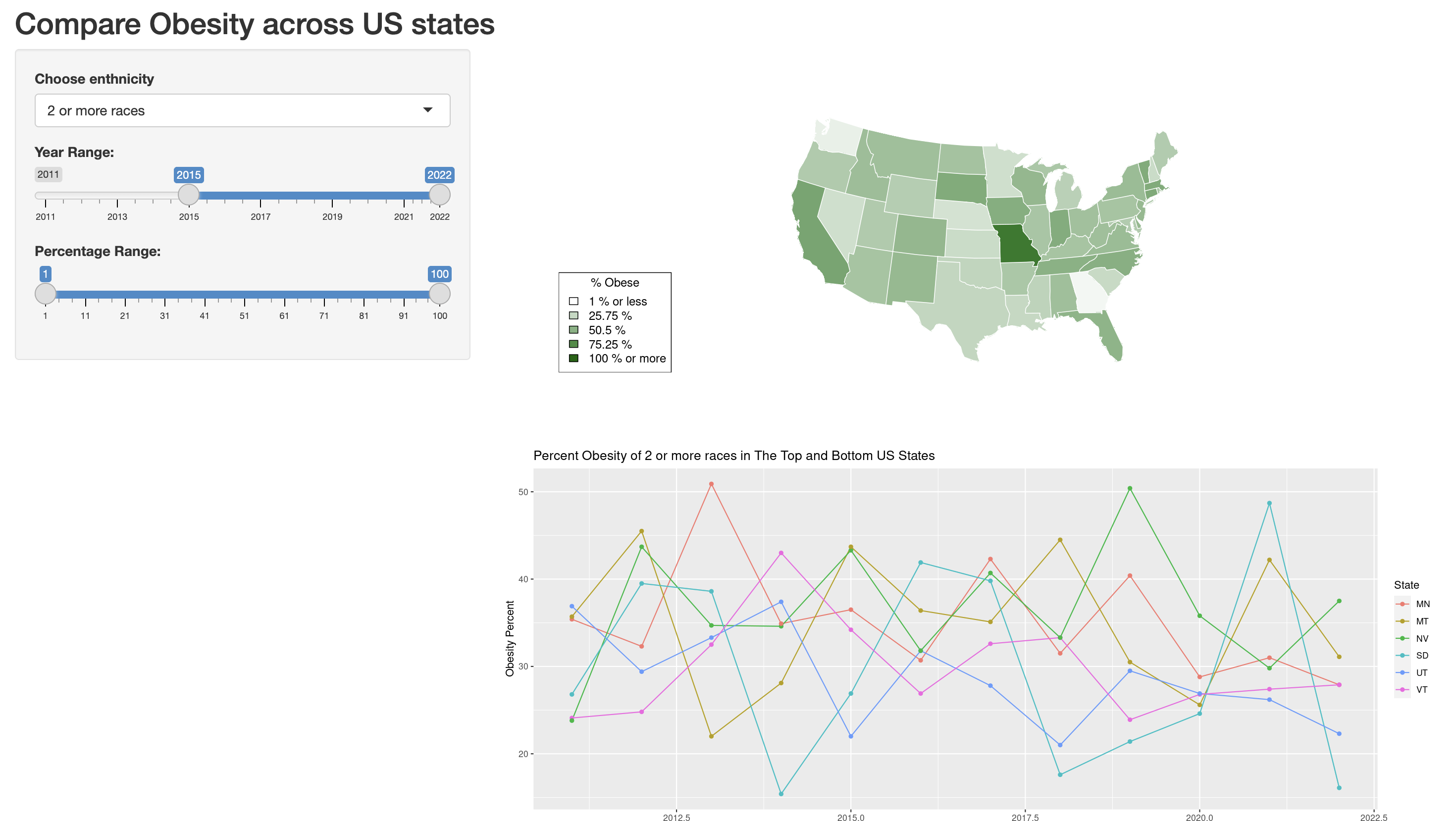
App preview: choropleth US map and time-series by state
Features
- Dropdown selection for Ethnicity: filters all charts to the chosen demographic group
- Dual-handle Year Range slider (2011–2022)
- Percentage Range slider: narrow the obesity rate window displayed
- Choropleth map of the United States: states colored by obesity percentage with a 5-tier legend
- Time-series line chart tracking the top 3 and bottom 3 states by obesity rate within the selected filters
- All outputs update reactively, with no page reloads
Key Insights
This analysis is a very eye-opening look at the health of people across the United States. Interacting with different ethnicities and year ranges reveals stark disparities in obesity rates across demographics and geography. The app makes trends visible that would otherwise be hidden in raw tabular data, for example, how the distribution of high-obesity states shifts across different demographic groups over time.
Technical Details
- Built entirely in R using the Shiny framework
- Map rendered with ggplot2 and US map geometry
- Time-series charts with ggplot2 line geometry and faceting
- Hosted on shinyapps.io
- Reactive programming: server-side filtering and re-rendering on each user interaction