← Back to projects
Measles & GDP Analysis Dashboard
Interactive global visualization of measles incidence and its relationship with GDP per capita, using WHO & World Bank data, 2012–2024.
Measles by GDP Worldwide
The dashboard's primary view correlates measles incidence rates with GDP per capita across all countries and regions, surfacing how economic development relates to outbreak frequency and vaccine coverage. Interactive Leaflet maps allow users to explore spatial patterns; Plotly line charts show trends over time by country.
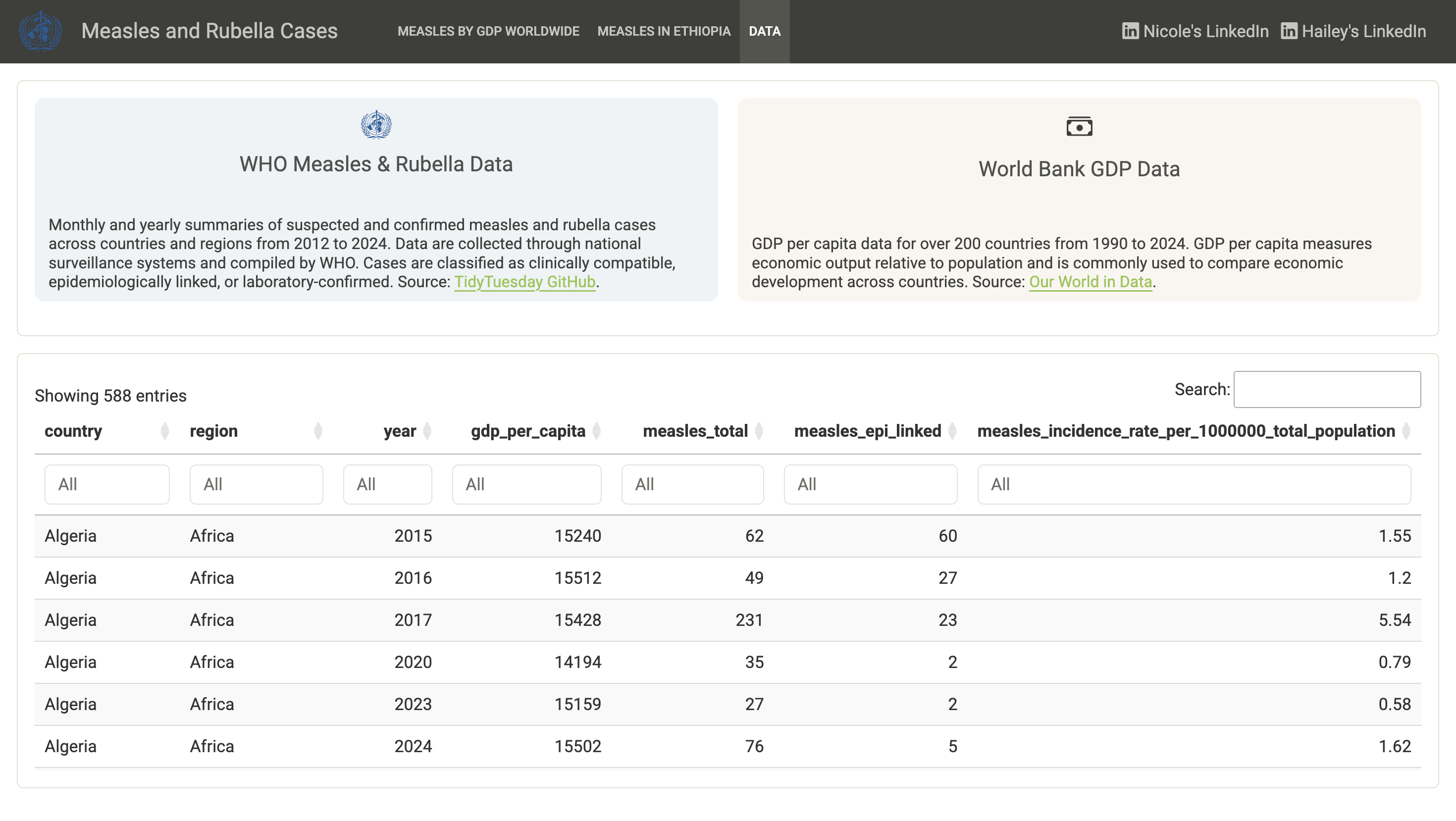
Dashboard preview: searchable dataset with 588+ country-year records
Features
- Built with R, Shiny, and Quarto Dashboard
- Tabs: Measles by GDP Worldwide · Measles in Ethiopia · Data
- Leaflet choropleth maps of measles incidence and GDP per capita
- Plotly and ggplot2 time-series and scatter visualizations
- Case study on Ethiopia's measles surge and temperature patterns
- Searchable, filterable table: 588+ country-year records from WHO surveillance
Data Sources
- WHO Measles & Rubella Data: monthly and yearly confirmed case summaries across countries, 2012–2024
- World Bank GDP Data: GDP per capita for 200+ countries, 1990–2024, via Our World in Data